
Web Components with Dojo
Rene Rubalcava | September 21, 2018
We previously saw how we can create a custom date picker with Dojo. If building custom widgets with Dojo wasn't cool enough, one of the features that Dojo provides that set it apart is the ability to export your custom widgets to Web Components.
This is incredibly useful because you could create a encapsulated widget in Dojo, including all business logic and now reuse this component anywhere you want.
You can review the documentation on how to export widgets to web components here.
Firs thing you need to do is npm install @dojo/cli-build-widget in our DatePicker project. Once that is done, we just need to make some updates to the widget in our application to encapsulate some styles and other small bits.
First, let's update src/widgets/styles/datepicker.m.css.
@import url("https://fonts.googleapis.com/css?family=Roboto");
@import url("https://stackpath.bootstrapcdn.com/font-awesome/4.7.0/css/font-awesome.min.css");

.root {
    font-family: "Roboto", sans-serif;
  text-align: center;
  padding: 0.5em;
  color: #000;
}

input {
  font-size: 1.2em;
}

button {
  color: #fff;
  background: rgb(16, 184, 10);
  padding: 1em;
}

.hidden {
  display: none;
}

.calendarcontainer {
  background: #fff;
}
Now we have included all the styling for our widget, including the required fonts into the css for the widget.
Next, we need to add the customElement decorator to our widget to define the tags and any attribute and event information.
// src/widgets/DatePicker.ts
import { v, w } from '@dojo/framework/widget-core/d';
import { WidgetBase } from '@dojo/framework/widget-core/WidgetBase';
import Calendar from '@dojo/widgets/calendar';
import EnhancedTextInput from '@dojo/widgets/enhanced-text-input';
// Used to define web component element tag name
import customElement from '@dojo/framework/widget-core/decorators/customElement';
import * as css from './styles/datePicker.m.css';
...
@customElement<DatePickerProperties>({
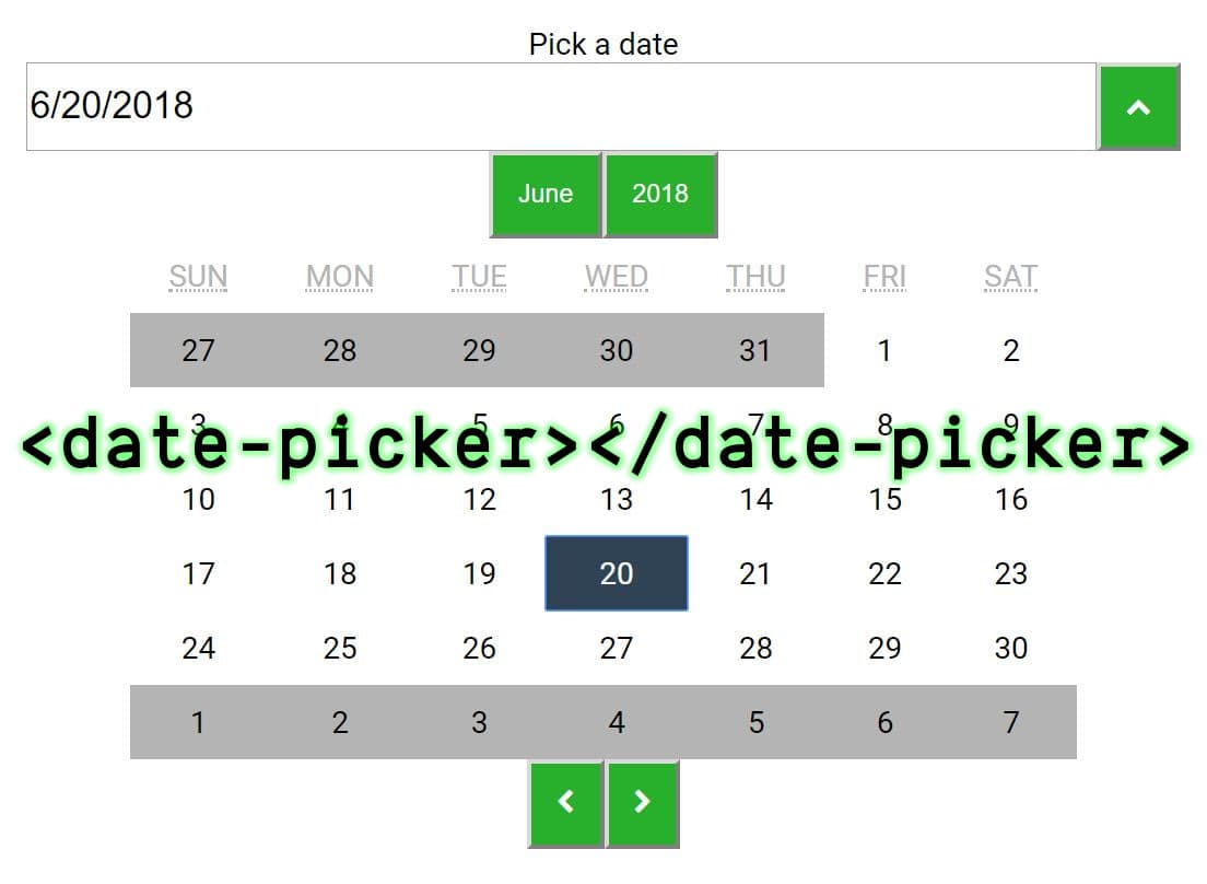
tag: 'date-picker' // custom element can be defined as <date-picker></date-picker>
})
export class DatePicker extends WidgetBase<DatePickerProperties> {
...
}
export default DatePicker;
Now the last thing we need to do is update the .dojorc with a "build-widget" section.
{
  "build-widget": {
    "elements": ["src/widgets/DatePicker"]
  }
}
With all these changes in place, you should be able to now run dojo build widget --mode dist.
To test that our web component works correctly, we can create a new HTML file that uses it.
<!DOCTYPE html>
<html lang="en">
<head>
  <meta charset="UTF-8">
  <meta name="viewport" content="width=device-width, initial-scale=1.0">
  <meta http-equiv="X-UA-Compatible" content="ie=edge">
  <link rel="stylesheet" href="./output/dist/date-picker/date-picker-1.0.0.css">
  <script src="./output/dist/date-picker/date-picker-1.0.0.js"></script>
  <title>Date Picker Demo</title>
</head>
<body>
  <!-- Custom Element -->
  <date-picker></date-picker>
</body>
</html>
You should see a page with your date picker component now!
You can find the source code here.
And there you go, we just exported a Dojo widget that we previously built into a reusable web component. Try it out with your own components and feel confident that you can build awesome widgets that you can use anywhere!