Creating a DatePicker with Dojo
Rene Rubalcava | September 9, 2018
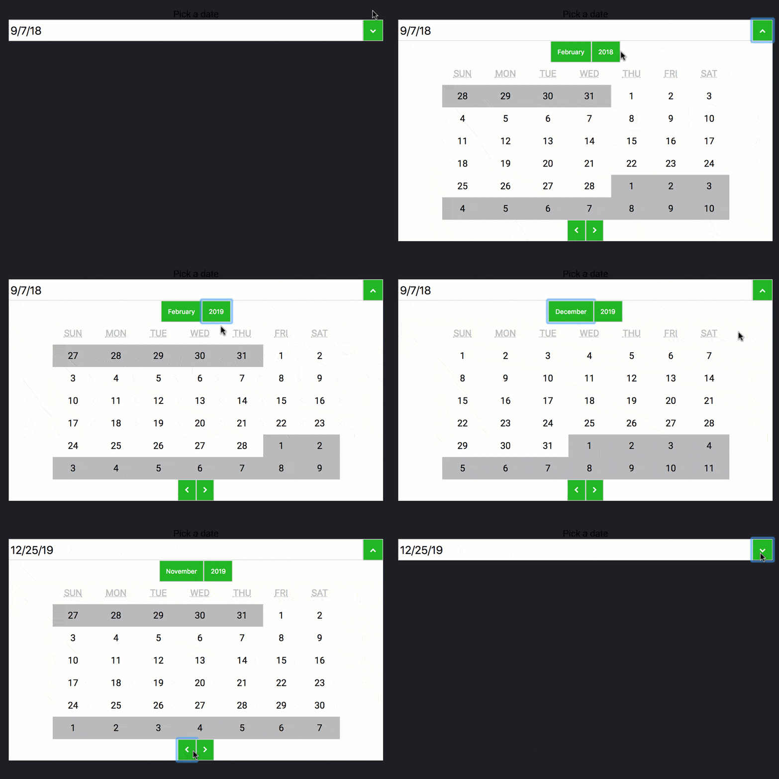
I recently talked about getting started with the @dojo/cli. This time around, I wanted to dive a little deeper and talk about using some of the provided widgets with Dojo to build a useful DatePicker widget.

This sample covers some pretty interesting concepts of Dojo, including widget composition, styling, date formatting with internationalization, and more.
Before we start, delete the default HelloWorld.ts and widget css file that came with the @dojo/cli output.
Create the widget
Our first step is to install the widgets library.
npm install --save @dojo/widgets
Now we can create a DatePicker.ts in the src/widgets folder.
// src/widgets/DatePicker.ts
import { v, w } from '@dojo/framework/widget-core/d';
import { WidgetBase } from '@dojo/framework/widget-core/WidgetBase';
import Calendar from '@dojo/widgets/calendar';

interface DatePickerProperties {
  selectedDate: Date;
}

interface DatePickerState {
  month?: number;
  year?: number;
  selectedDate?: Date;
}

export class DatePicker extends WidgetBase<DatePickerProperties> {
  state: DatePickerState = {
    month: 1,
    selectedDate: this.properties.selectedDate,
    year: 2018
  };

  protected render() {
    return v('div', [
      v(
        'section',
        {},
        [
          w(Calendar, {
            month: this.state.month,
            selectedDate: this.state.selectedDate,
            year: this.state.year,
            onMonthChange: (month: number) => {
              this.setState({ month: month });
            },
            onYearChange: (year: number) => {
              this.setState({ year: year });
            },
            onDateSelect: (date: Date) => {
              this.setState({ selectedDate: date });
            }
          })
        ]
      )
    ]);
  }

  // helper method to set the state
  protected setState(state: DatePickerState) {
    this.state = { ...this.state, ...state };
    this.invalidate();
  }
}

export default DatePicker;
In this widget, we are going to make use of the Calendar widget we get in @dojo/widgets.
This widget will have some simple state properties related to picking a date.
state = {
  month: 1,
  selectedDate: this.properties.selectedDate,
  year: 2018
};
You may also notice the helper method I added to help me update the state of my widget.
// helper method to set the state
protected setState(state: any) {
  this.state = { ...this.state, ...state };
  this.invalidate();
}
This will update the state object of my widget and call a this.invalidate() method that will update my widget based on the new state changes. This invalidate() method will be replaced by a @watch() decorator on properties in a future version of Dojo to simplify updates. Other than that, I pretty much followed the Calendar example provided in the documentation.
But let's make things a little more interesting. I want an input box that will display my selected date. For this, I'm going to use the EnhancedTextInput.
w(EnhancedTextInput, {
  addonAfter: [
    v(
      'button',
      {},
      [
        v('i', {
          classes: [
            'fa',
            'fa-chevron-down'
          ]
        })
      ]
    )
  ],
  label: 'Pick a date',
  value: this.state.selectedDate
})
I wanted to use the EnhancedTextInput because it lets me add a button to it using the addonAfter contents. I found this to be very useful! You'll notice I'm using Font Awesome to help me out here. Since we're at it, let's talk about some styling.
CSS
Create a src/widgets/styles/datepicker.m.css file.
/* src/widgets/styles/datepicker.m.css */
.root {
    text-align: center;
    padding: 0.5em;
    color: #000;
}

.hidden {
  display: none;
}

.calendarcontainer {
  background: #fff;
}
Notice I added a hidden class. We'll use that in a moment. But first, let's modify the src/main.css file.
/* src/main.css */
@import url('https://fonts.googleapis.com/css?family=Roboto');
@import url('https://stackpath.bootstrapcdn.com/font-awesome/4.7.0/css/font-awesome.min.css');

body {
    font-family: 'Roboto', sans-serif;
    color: #fff;
    background: #1d1f20;
}
input {
  font-size: 1.2em;
}

button {
  color: #fff;
  background: rgb(16, 184, 10);
  padding: 1em;
}
Here, I provide some styling for my input, my buttons and some typography.
With the css ready for the application, we can start making the widget a little more interactive.
Interactivity
Part of the functionality of the DatePicker is to have the calendar open and close on a button click. We can add a visible property to our state object.
state = {
  month: 1,
  selectedDate: this.properties.selectedDate,
  year: 2018,
  visible: false
};
Lets modify the button to update the visible state.
v(
  'button',
  {
    onclick: () => {
      this.setState({ visible: !this.state.visible });
    }
  },
  [
    v('i', {
      classes: [
        'fa',
        this.state.visible ? 'fa-chevron-up' : 'fa-chevron-down'
      ]
    })
  ]
)
Now onclick will update the visible state and that will determine the button icon. We'll also update the container for the Calendar so it can toggle the visibility.
v(
  'section',
  {
    classes: [this.state.visible ? '' : css.hidden, css.calendarcontainer]
  },
  [
    w(Calendar, {
      ...
    })
  ]
)
AWESOME!! We now have a fully interactive DatePicker. But we're not updating the value of the EnhancedTextInput with the selected date. But we can't just show the date any normal way. We want our DatePicker to support various locales. We can do with @dojo/framework/i18n.
Internationalization
I'm not going to get in to detail on using i18n, it's incredibly powerful. But we're going to use it to support formatting our dates accordingly.
First, we need cldr-data for our application to use.
npm install --save cldr-data
Next, update the .dojorc file to use it.
{
    "build-app": {
        "locale": "en",
        "supportedLocales": [ "es", "fr", "hi", "ar", "ja" ],
        "cldrPaths": [
            "cldr-data/main/{locale}/ca-gregorian",
            "cldr-data/main/{locale}/dateFields",
            "cldr-data/main/{locale}/numbers",
            "cldr-data/main/{locale}/timeZoneNames",
            "cldr-data/supplemental/likelySubtags",
            "cldr-data/supplemental/numberingSystems",
            "cldr-data/supplemental/ordinals",
            "cldr-data/supplemental/plurals",
            "cldr-data/supplemental/timeData",
            "cldr-data/supplemental/weekData"
        ]
    },
    "test-intern": {},
    "create-app": {}
}
Now we can support various locales for working with dates.
// src/widgets/DatePicker.ts
import { formatDate } from '@dojo/framework/i18n/date';

...

w(EnhancedTextInput, {
  addonAfter: [
    ...
  ],
  label: 'Pick a date',
  value: formatDate(
    this.state.selectedDate || this.properties.selectedDate,
    { date: 'short' }
  )
})
We are going to use the formatDate() method to format our date in the EnhancedTextInput accordingly. I could take this a step further and provide the Pick a date text in various locales, which isn't difficult to do. You can read more about supporting various languages here.
Put it all together
Now we can add the DatePicker to our main application.
// src/main.ts
...

class App extends WidgetBase {
  protected render() {
    return v('div', [
      w(DatePicker, { selectedDate: new Date() })
    ]);
  }
}
...
And voila! You have a finished and useable DatePicker with styling and internationalization. I'm sure you could make this look better than I did, I never claimed to be a good designer, I just know enough to get things done.
You can see the source code for the complete application on github.
I also want to point out that you can try out some Dojo in codesandbox, although I have had some issues with i18n in the sandbox, which is why this sample isn't provided there.
Now you can go forward and make some awesome widgets of your own!

